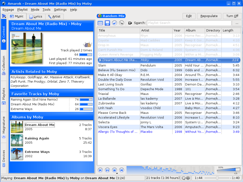
When I started using Linux back in 2006, the first media player that I encountered was rhythmbox and somehow it did not appeal to me. Then I came across Amarok 1.4 and even though it pulled in a lot of KDE-3 dependencies ( I was using Ubuntu) I stuck with it for the simple reason that it was the best media player that I had ever used – including all the various ones that I had tried on Windows (foobar, songbird, winamp, windows media player, etc.) and the few that I tried on Linux (rhythmbox, banshee, etc.). As a recap, let us look at the screenshot below of version 1.4 (taken from the official Amarok website).
Take a look at the Now Playing view – it tells me all about the songs that I need to know. It tells me what the song is called, who is the artist, about the album, the length of the song , the year, where is it stored amongst others (eg. bit rate). The emphasis on the now playing view was what I really liked. The left tab could then be switched to display information about the artist (from wikipedia), the lyrics or display information about the song (how many times has it been played) and display other songs from the same artist that were already present in my collection.
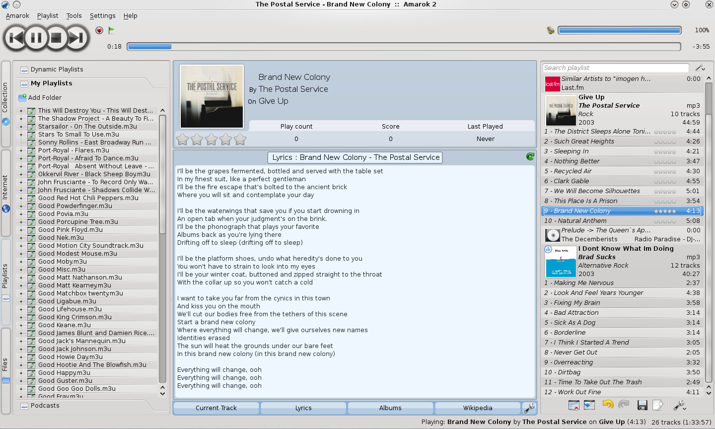
Now, compare this to the current stable version of amarok (2.1.1). Again, lets take a look at a screenshot from the Amarok website.
Now look at what they did to the now playing playlist. It has been banished to the right corner of the window and it shows no information other than the title of the song. If you are playing 12 songs from the same album the album and its details will appear at the head of the 12 songs and those 12 songs will not have that individual information in the playlist view. Why? How about albums when there are different artists for each song?
And let’s not talk about the stability for now. Amarok 1 was already three years old from its first official release when I used it in 2006 so it was quite a mature product. In comparison, Amarok 2 is only half a year old as of now and it would take some time to reach the same level of maturity as that of Amarok 1. However, this brings me to the question – why reinvent the wheel? I am strictly reflecting on the changes in the UI – changes in backend (integration with phonon and other KDE4 services) was, I believe, necessary to integrate tightly with KDE4 but the drastic overhaul in the UI was not. Why change something that was working – and working very well. The alignment of the playlist and the context view did not, in my opinion, require any change.
As an example of this, we can look at Kile – another of my favourite KDE applications – it is the best Latex editor when it comes to Linux. The KDE4 version does not bring any major UI overhaul – it is still tightly integrated with KDE4 and yet the user experience does not change. Something similar should have been done with amarok as well. Or maybe in the true spirit of open source, there is someone out there who would port Amarok 1.4 to Qt4. 🙂
However, at this stage, Amarok has completely lost me. I have switched over to MPD with QMPDClient and ncmpc as the two frontends. I would recommend any one else who is tired of Amarok 2 to give MPD a go. And hopefully, Amarok will be able to win me back some day. 🙂

